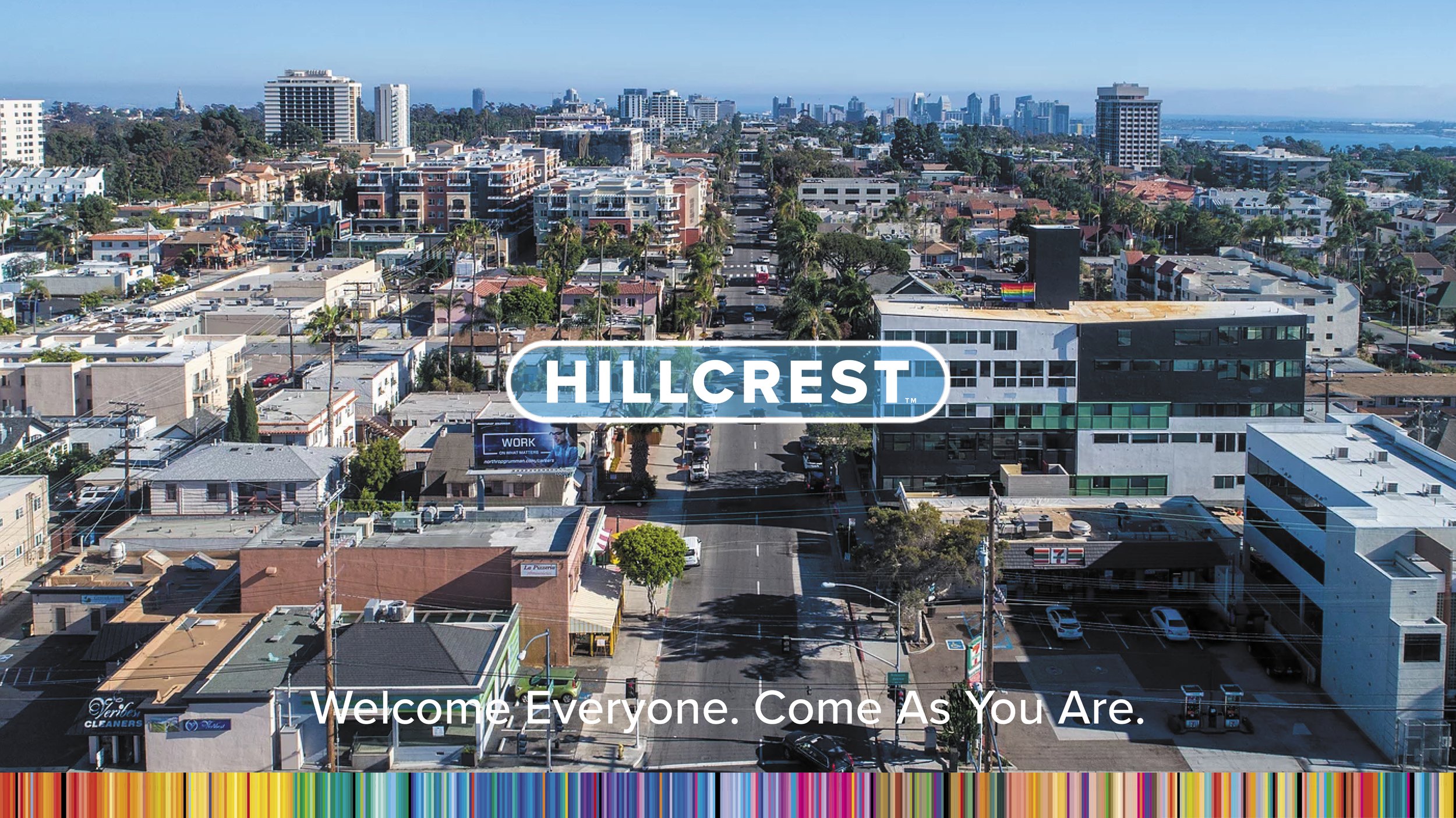
Hillcrest, San Diego CA
We designed a brand strategy that captures the culture by defining the legacy and value of the neighborhood and its community.
Destination and Environmental Graphic Design
Brand Identity System
Naming and Taglines
Hyper-local Strategy
Campaign & Experience
Placemaking & Wayfinding
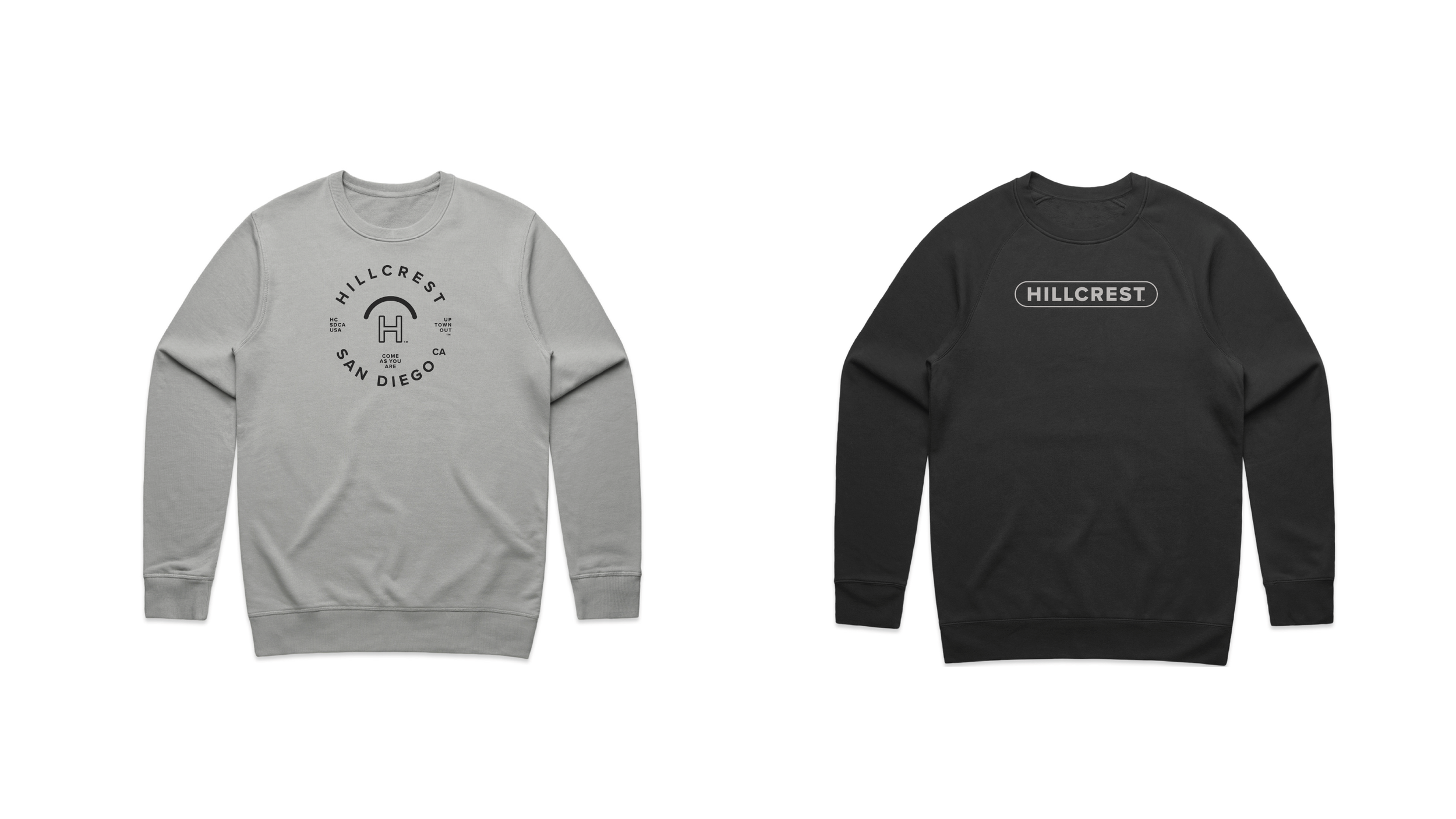
Merchandise Product
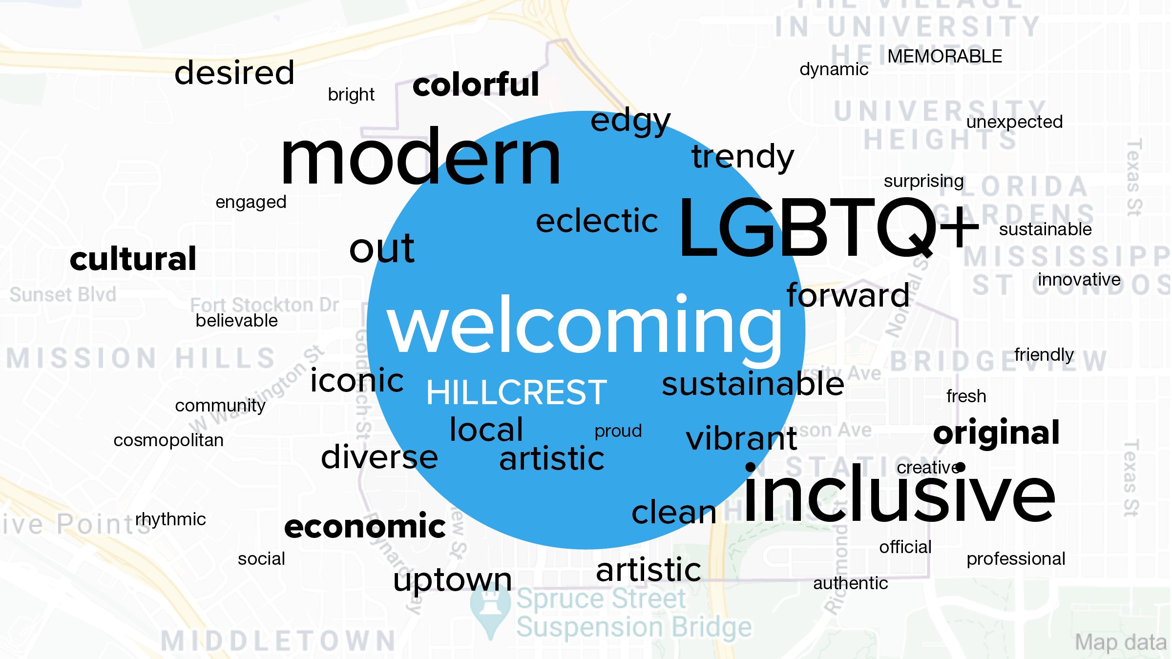
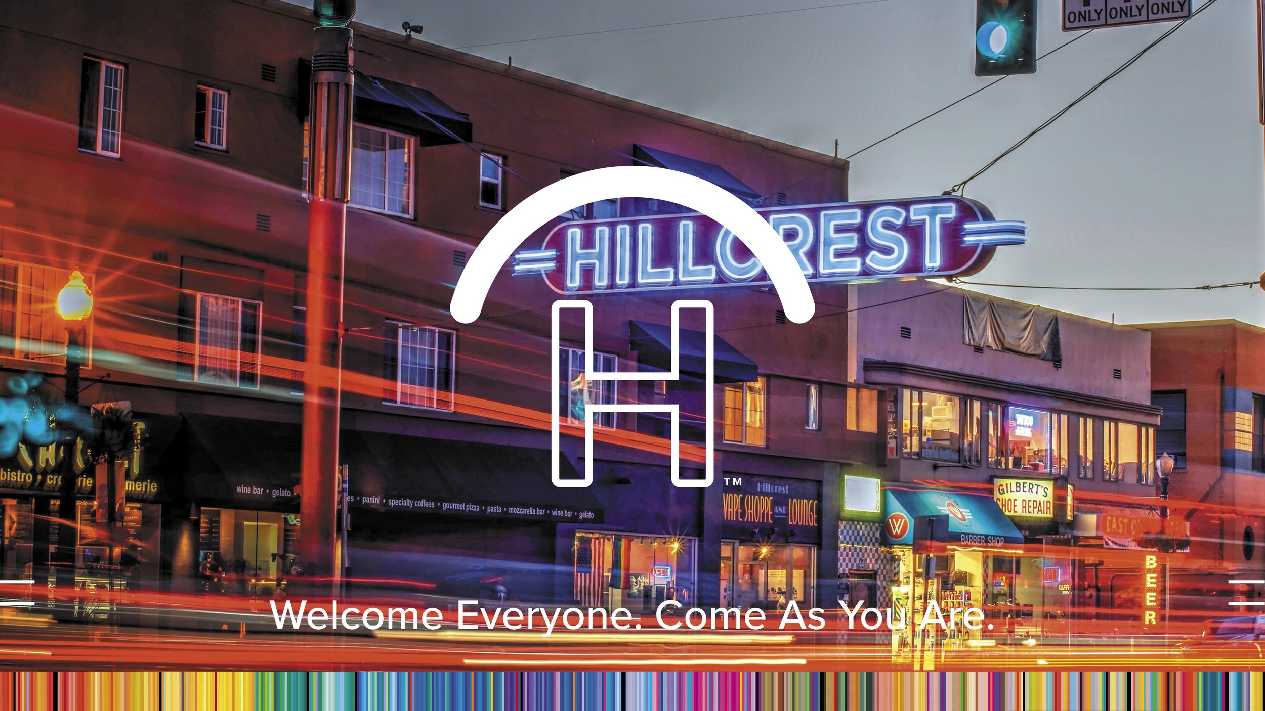
Hillcrest has long been connected to the overarching colors of diversity. Known to be welcoming and eclectic, the neighborhood is the center of the San Diego’s LGBTQ+ community. The Hillcrest landmark neon sign, on the corner of 5th Ave and University Ave, is public art that highlights the inclusive “Gateway” to visitors.
Objective:
Design a brand designed to better support, reflect and care for the neighborhood. An inclusive, sustainable, and equitable, community tool for the people.
“Welcome Everyone to the LGBTQ Cultural District of San Diego”
Come UptownOut into Hillcrest
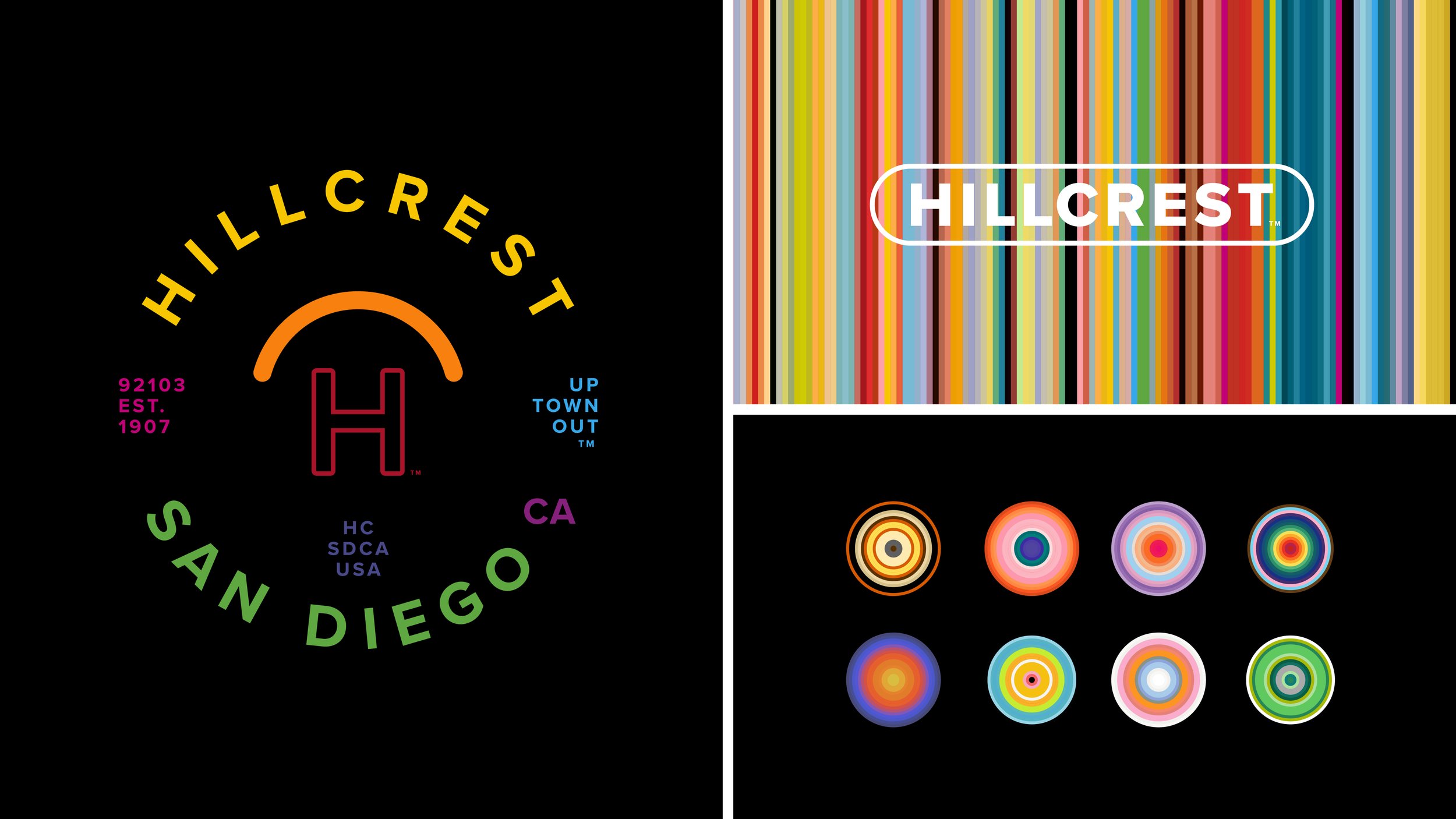
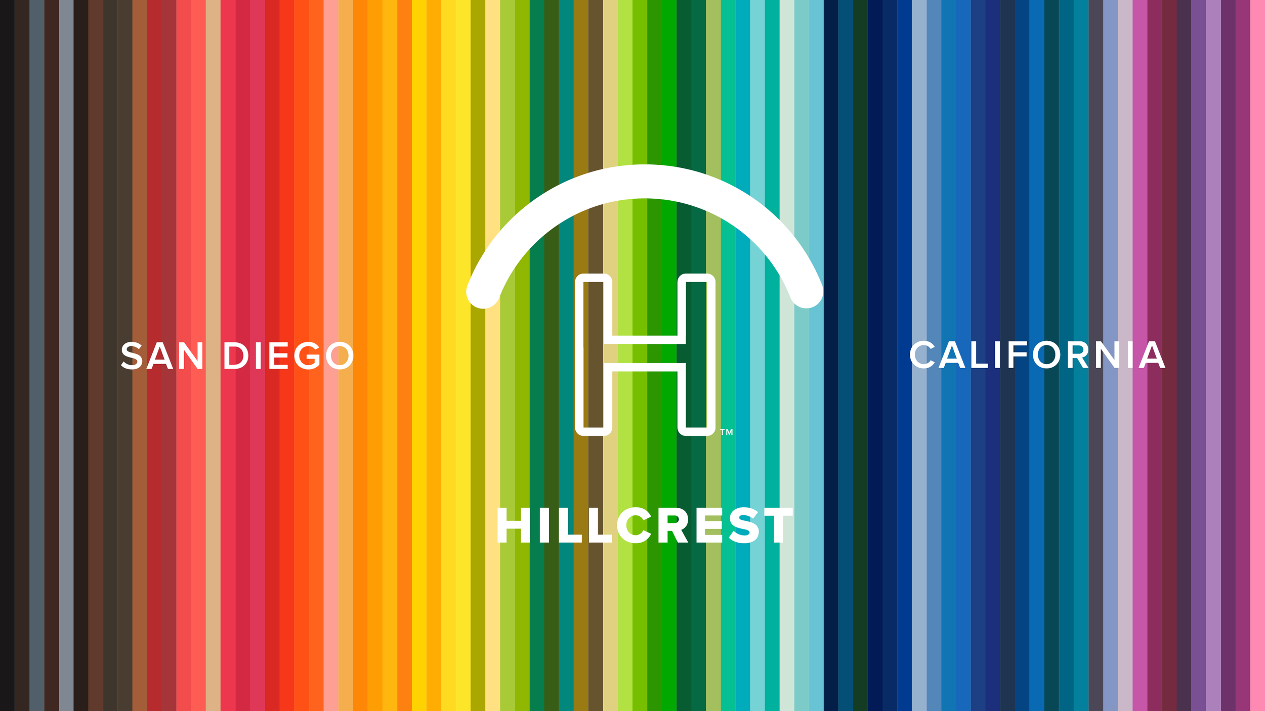


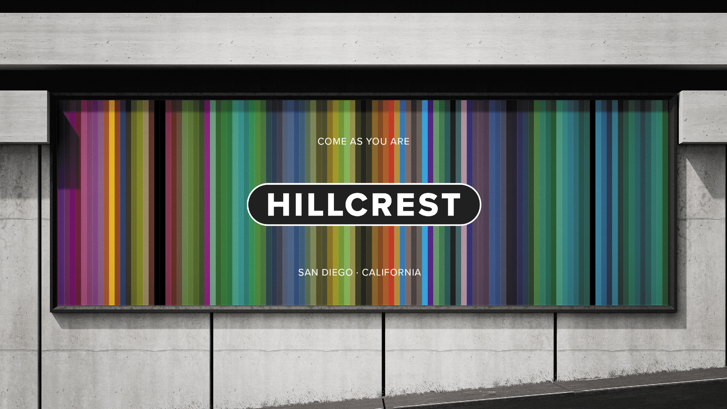
ROYGBV+
RED ORANGE GREEN BLUE INDIGO VIOLET Plus every other color




As You Are. As We Are.
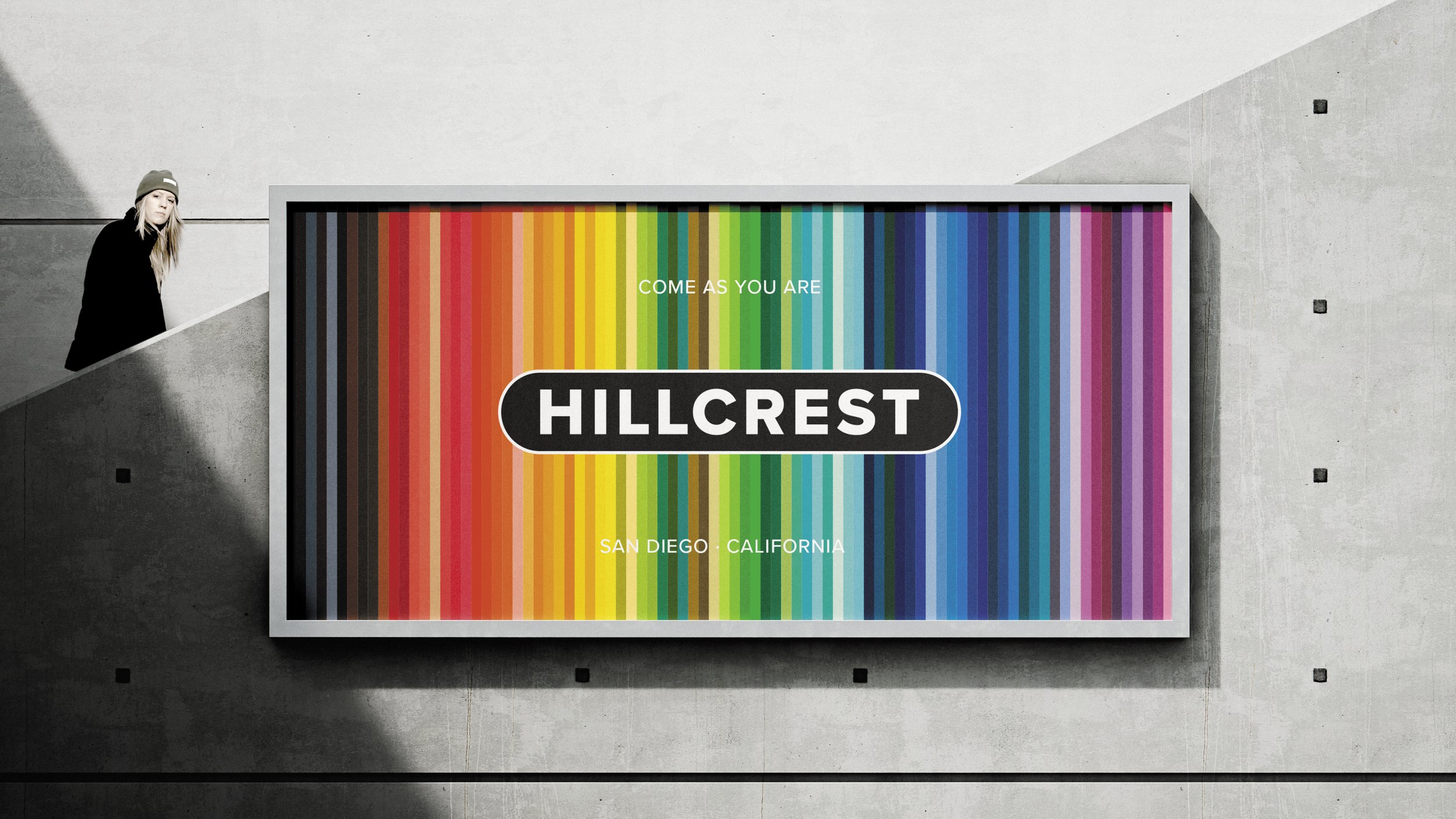


HyperLocal Hillcrest Destinations
Normal Street Market - home of the Pride Flag and Hillcrest Farmers Market. Located West of Centre Street at a 69 degrees
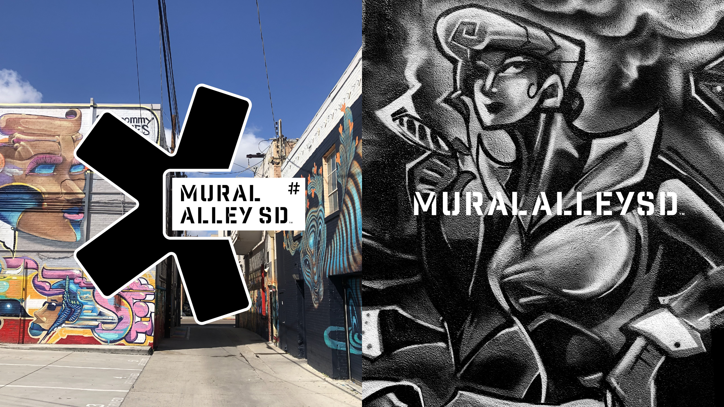
Mural Alley SD - between 4th and 5th Ave at University.
Pride Cross - the Rainbow crosswalk at Pride Flag on Normal Street

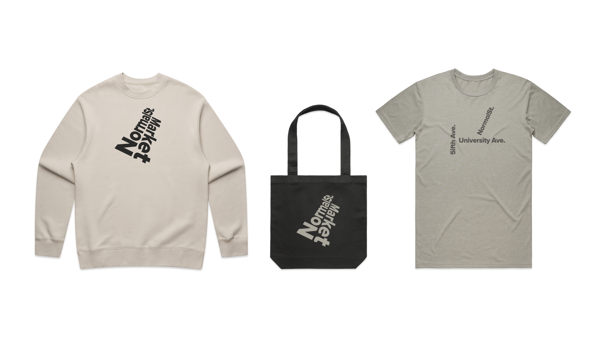
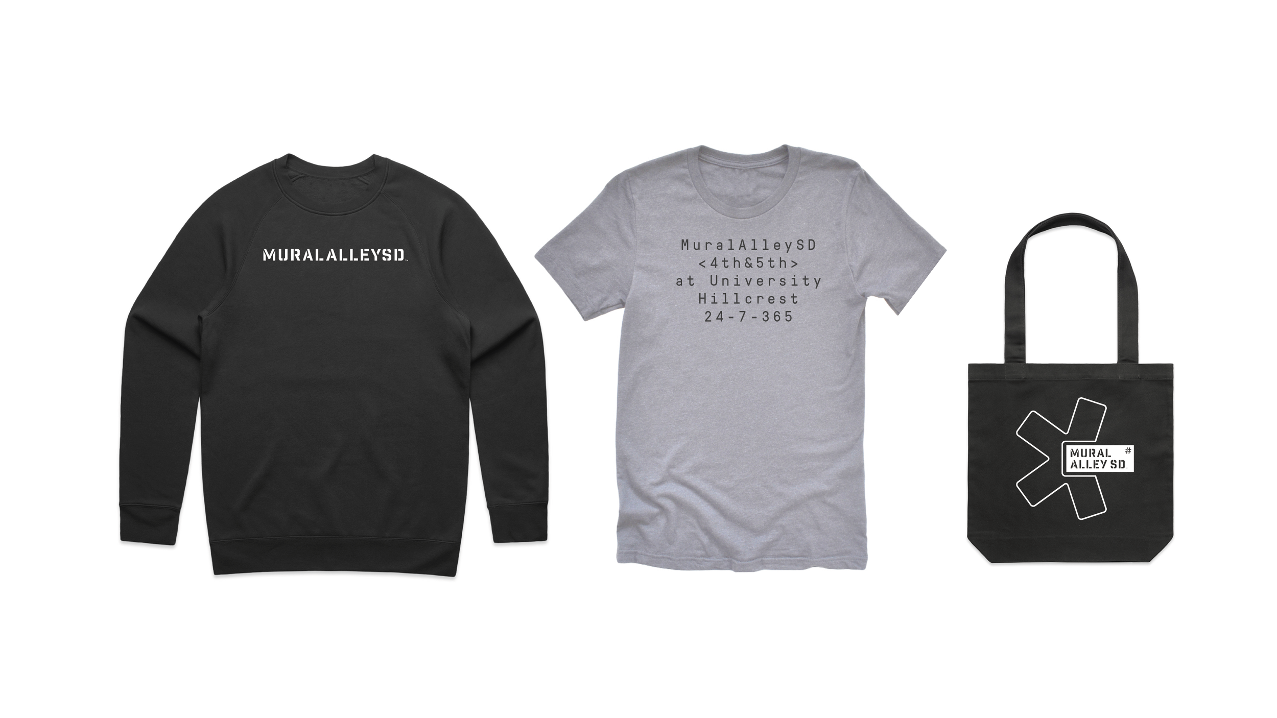
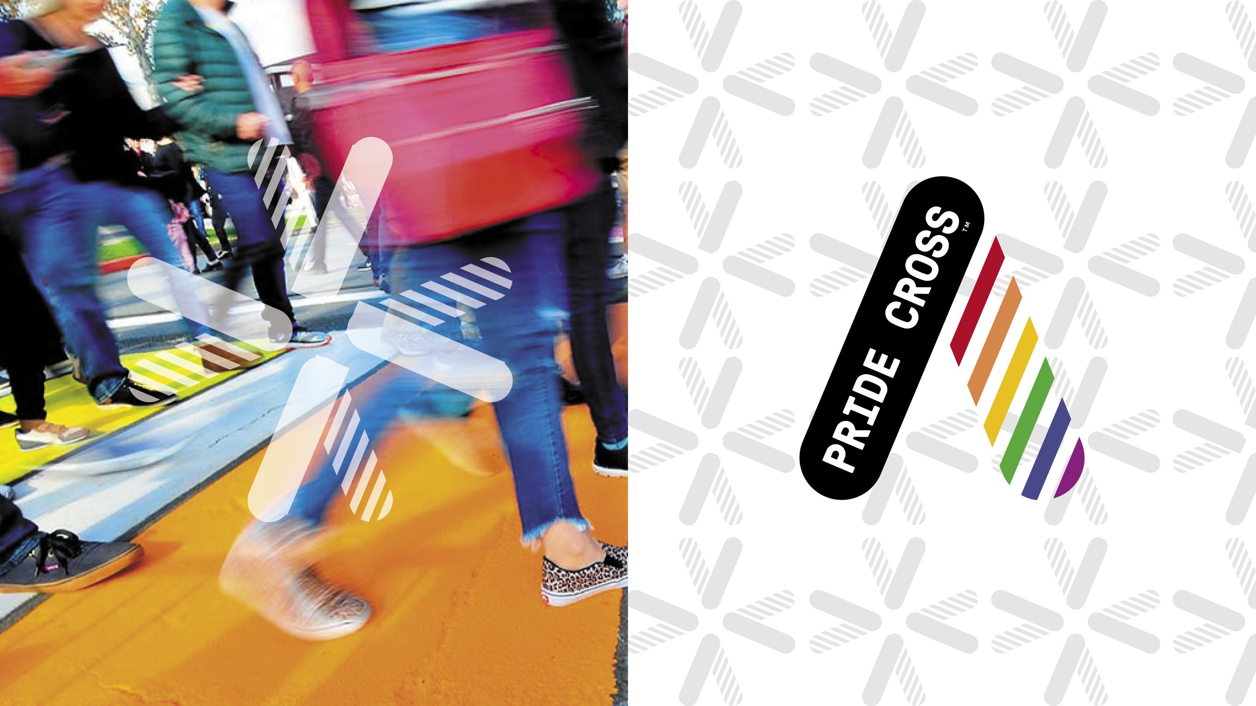
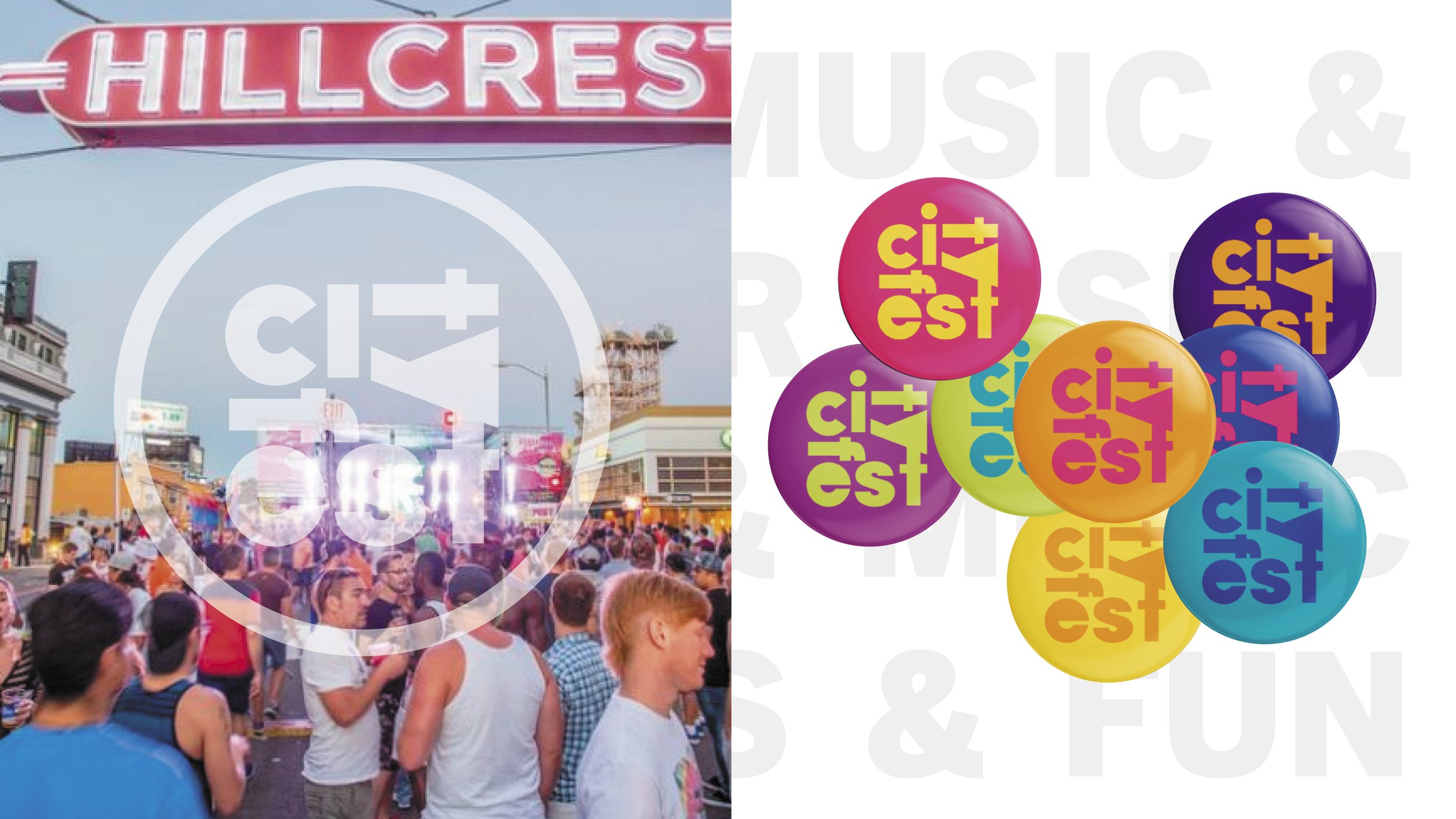
Iconic Neighborhood Sign is also Public Art
The Hillcrest Sign.
The Hillcrest landmark neon sign, on the corner of 5th Ave and University Ave, is also public art that highlights the inclusive gateway to visitors.
In 1940 the "HILLCREST" lighted sign at the intersection of University and Fifth Avenue was first erected, donated by the Hillcrest Women's Association, a group of local female shopkeepers.
A similar sign appears in images dated c. 1930. After falling into disrepair, it was taken down and rebuilt in 1984 and again in 2023.
Lead by Design.
Own and Celebrate the LGBTQ+ Brand Identity.
BELOW: ”We can do this better” says everyone.
It started with focus groups and community feedback about the current look. (see below) “A Vegas knockoff” - “A 1987 kitsch casino with free drinks” said another. “Stock glamour shots said someone” “It just doesn’t look LGBTQ at all” said yet another.
It’s pretty clear there’s no consistent brand strategy to reflect the culture, community, neighborhood or the people who call it home.
Challenge:
How might a neighborhood identity represent its distinct historical LGBTQ+ community and everyone else in a modern way?
Solution:
Balance the future with the past to create an authentic, inclusive, people focused identity system with eclectic energy for today and ready for change for tomorrow.
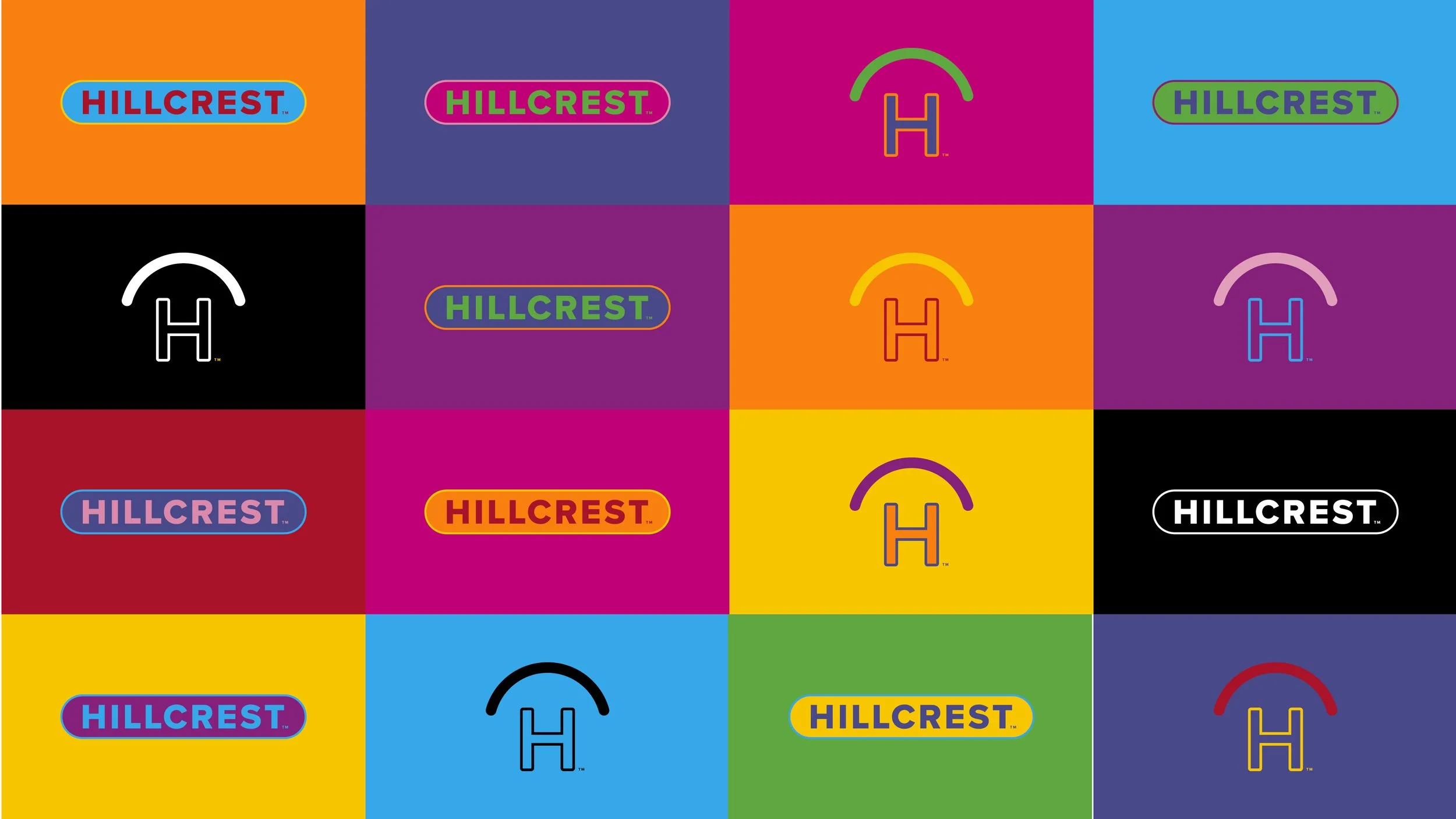
With a courageous mission that strongly represents LGBTQ+ and equally welcomes everyone — Hillcrest needed a flexible and colorful, hyper-local neighborhood identity system that would create instant recognition and invite people into the experience.
• Give Hillcrest a Hyper-local brand destination strategy that is authentically LGBTQ+ and welcomes everyone.
• Replace the outdated and unimaginative with Confident, Engaging. Inclusive.
• Drive economic impact though branded goods and places that gives back to the neighborhood. Percentage of sales to the community.
Brand Voice:
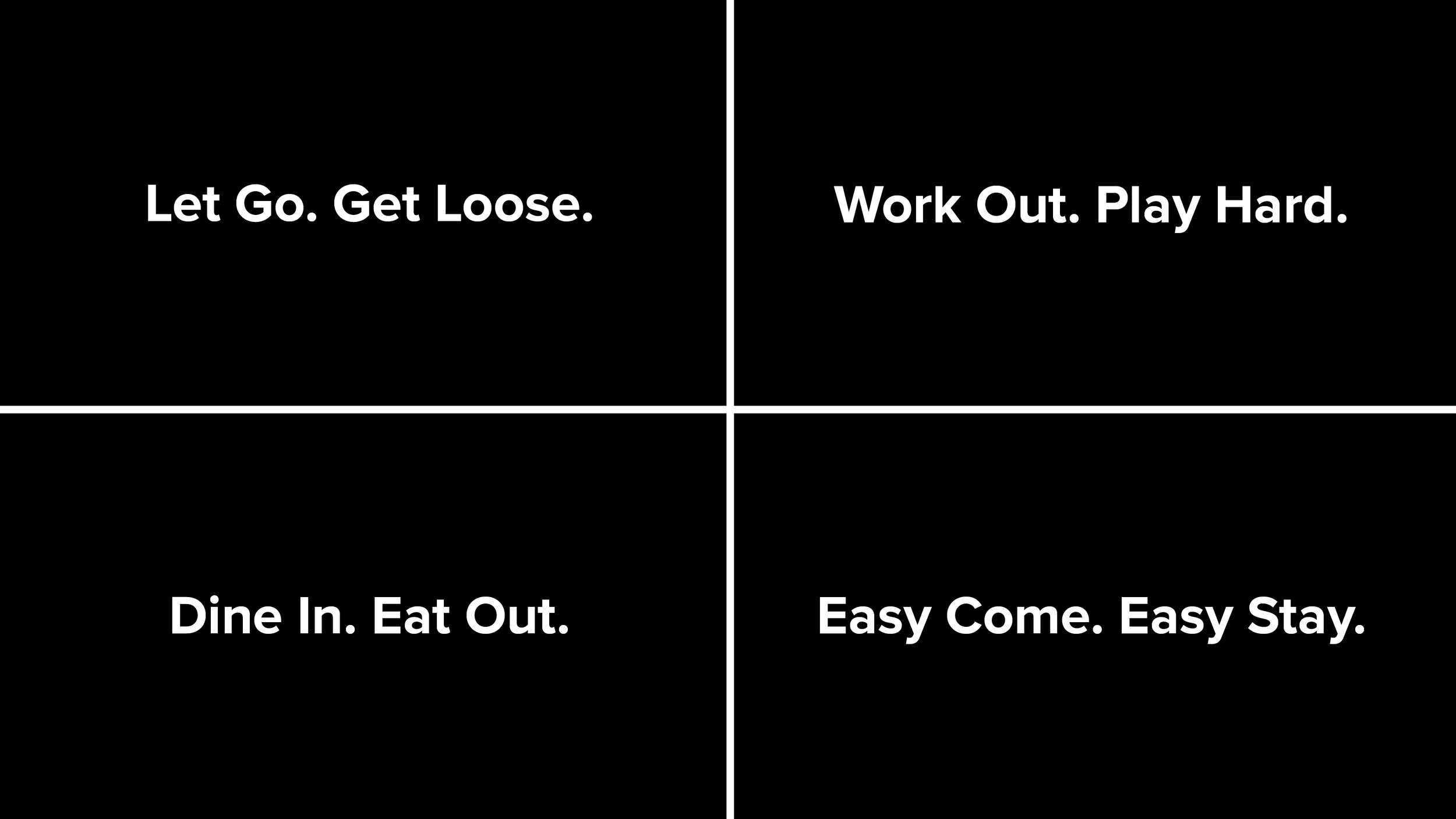
Used in headlines, UptownOut breaks apart and brings culture into the conversation; reminding everyone they are welcome to be themselves.
Tagline:
Come UptownOut into Hillcrest.
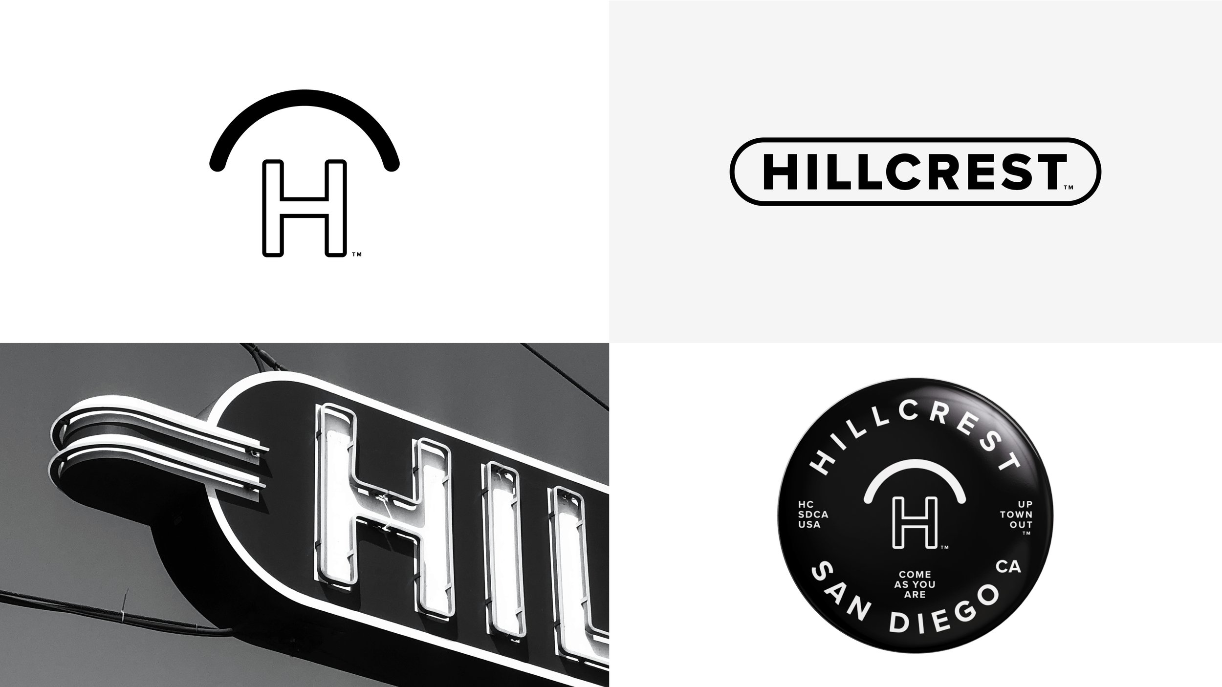
Logos:
Hc is a Rainbow Gateway Monogram
Hillcrest Sign Minimalized and Modernized
NrmlSt. - Pride Cross - Mural Alley SD become place logos
Outcome:
The new identity system ensures the unique and colorful community position and enables a modern brand visual consistency while helping businesses, visitors and residents feel included.
The Neighborhood merchandise brand store will donate a percentage of profit to help keep the streets clean and safe.


